

TWO WOODS ESTATE
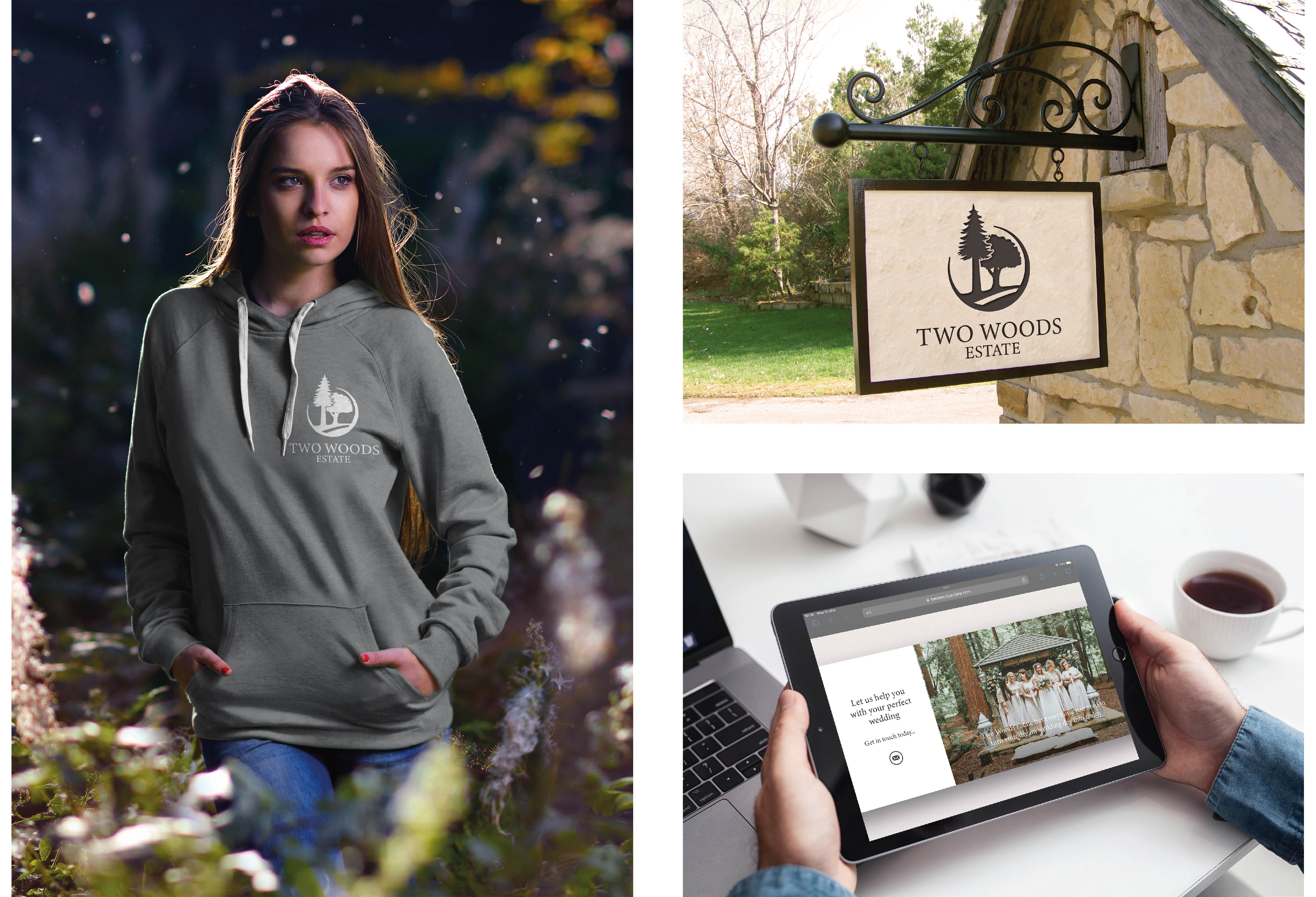
Rob and Woody approached us when they purchased the Two Woods estate to completely rebrand the business and bring it much more in line with the outdoor site and the services it offers as a venue. There was a real desire to tap into the beauty of the natural surroundings that the venue offered to anyone wanting to get married in the great outdoors, particularly the cathedral like quality of the largest redwood woods in the UK. The site is primarily made up or pine and deciduous trees and the brief developed over time required both these elements to be depicted in an icon logo. After a 3 stage branding process and subsequent web design and build we delivered Rob and Woody a timeless brand that resonates with both the land, business and happy couples who continue to use the space for their special day.
Designing a logo featuring two trees for a wedding company with a beautiful outdoor venue set in the woods can be a captivating representation of the company's identity. These trees can symbolize the union of two individuals, perfectly aligning with the essence of weddings. By carefully selecting colors that reflect the serene ambiance of the woodland setting, such as earthy greens and soft browns, the logo conveys the tranquil and enchanting atmosphere of the outdoor venue. This design approach not only visually resonates with the company's offerings but also creates a strong emotional connection with couples seeking a picturesque, rustic wedding experience in the woods.
Moreover, the creation of brand guidelines is crucial to maintain consistency and coherence in all aspects of the wedding company's branding. These guidelines should outline the approved color palette, typography, logo usage, and any specific design elements related to the brand, ensuring that all marketing materials, signage, and digital assets align with the company's visual identity. Consistency in branding not only enhances brand recognition but also builds trust and reliability among potential clients. It helps convey a sense of professionalism and dedication to the highest standards, which is especially important in the wedding industry, where clients seek assurance and a seamless, memorable experience on their special day.
Translating this brand identity into a flowing, natural, and beautiful website is essential to provide potential clients with an immersive digital experience. The website should mirror the enchanting woodland setting by integrating lush imagery of the outdoor venue, showcasing the natural beauty of the woods, and the magical ambiance it provides. A harmonious color scheme that complements the logo, such as soft greens, earthy browns, and calming neutrals, can be used throughout the site to maintain consistency and convey the serenity of the surroundings. Additionally, user-friendly navigation, elegant typography, and well-structured content can create a seamless and informative platform where couples can explore the wedding services offered, view real wedding galleries, and easily get in touch with the wedding company. By combining captivating visuals with intuitive functionality, the website becomes an extension of the brand, enticing couples to envision their dream woodland wedding and reinforcing the company's commitment to crafting unforgettable moments in nature's embrace.
Woody, one of the owners of Two Woods Estate was kind enough to say this about working with us. "We commissioned Stonefern as we wanted to rebrand our business after purchasing it. We were looking for a new logo and font that we could use across multiple web and social media platforms to give us a consistent and uniform presence. Mark came to visit us at Two Woods Estate to walk round and talk through what the business did, our ethos and we were looking for from our logo. He gathered lots of information about the types and styles of brands that we liked and set about producing a batch for us to consider and discuss.
This was a first time experience for us so we needed a bit of guidance. Mark was very helpful throughout and was always available to talk through where our thoughts were going. We had a fair bit of direction changes with the logo from our end and Stonefern were great at acting quickly to get us new designs to consider.
In the end we got there, a logo design that we our proud to have out there and relaunch our brand with - once we get the new website up - and that we can use in all electronic media formats as well as stationery, clothing, signage, livery.... With the support of Stonefern and Mark the whole process took a little over a month, which is great and means we can progress on to the next stage of our rebrand, the website. We will be continuing to work with Stonefern going forward for our branding needs.”


