WHY TYPOGRAPHY IS KEY TO BRANDING
There are millions of fonts out there and choosing the right one can have a huge impact on how your message is interpreted and how your brand is perceived. Typography is crucial in branding, getting the right fonts, the right tone and feel to the typeface using it correctly in your assets and collateral is very important.
THE TONE, FEEL AND VOICE OF THE TYPEFACE
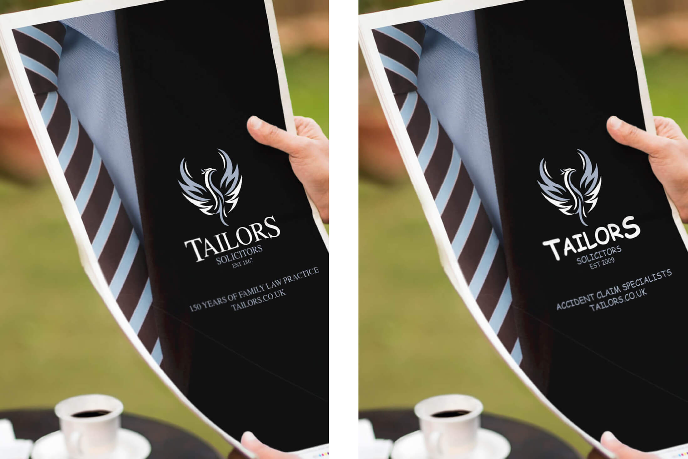
Above are two logos for Taylor’s Solicitors (a fake firm created to illustrate this point). The left hand logo has Times as its typeface, which inspires faith in knowledge, quality and their reputation in the beholder. The right hand logo, however, is comprised of Comic Sans, probably the most hated font in graphic design and branding. This font is childish, immediately taking away the feel of expertise, quality and experience. Unfortunately, Comic Sans is used all too often, with brands ruining their chances of being respected and trusted by using it. This shows how important it is to choose the right typeface for your brand.
You also need to consider the reaction and impact that your chosen font has on the reader. Fonts, according to Eben Sorkin, that match the personality of the text, “enhances the impact and processing of the communication”. This shows that if the font is chosen correctly, and matches the personality of the text, people are more likely to react in the way you want them to, and they will read it more quickly and easily. The easier it is for them to read and understand, the easier it is for them to react, and the more likely they are to do so. This again shows the importance of choosing the right font to cause your desired reaction.
Let’s look at four fonts and their tones, feels and voices, what they are suitable for and unsuitable for:

ABYS
by Ioana Archontaki: Artistic, fun, slightly urban.
Suitable for: Headings, titles and logos for an organisation that wants to present itself as less constricted, less smart and more teen-like.
Unsuitable for: Body text, or anything for an organisation trying to present itself as smart, elegant and upper-class.
BEBAS NEUE
by Dharma Type Classy, yet strong, smart, yet friendly, urban, yet sophisticated.
Suitable for: Headings, titles, and logos for an organisation that wants to present itself as smart, sophisticated, yet friendly and hip.
Unsuitable for: Body text, or anything for an organisation trying to present itself as childlike, artistic or elegant.

TIMES
by Stanley Morison Smart, strong, educated, sophisticated and powerful.
Suitable for: Headings, titles, logos and body text for an organisation that wants to present itself as smart, sophisticated, powerful and classy, knowledgeable and educated.
Unsuitable for: Anything to do with an organisation trying to present itself as childlike, artistic, less constricted, free or elegant.

SNELL ROUNDHAND
by Matthew Carter Elegant, sophisticated, classy and refined.
Suitable for: Headings, titles, and logos for an organisation that wants to present itself as elegant, expensive, sophisticated and refined.
Unsuitable for: Body text, or anything for an organisation trying to present itself as childlike, fun, strong, powerful or urban.
All four of these fonts have their uses, their places and their importance within branding, just not all together or in places where they should not be used. Choosing the right typeface for the right job is crucial, using it to get the right response and to create the reaction you want takes experience and knowledge to get right.
PLACEMENT AND APPLICATION OF YOUR TYPOGRAPHY
Reader friendliness is how well the onlooker can read the typography you are using. The size, the font and the colour all constitutes reader friendliness. Below are a two examples of getting it right and getting it wrong:
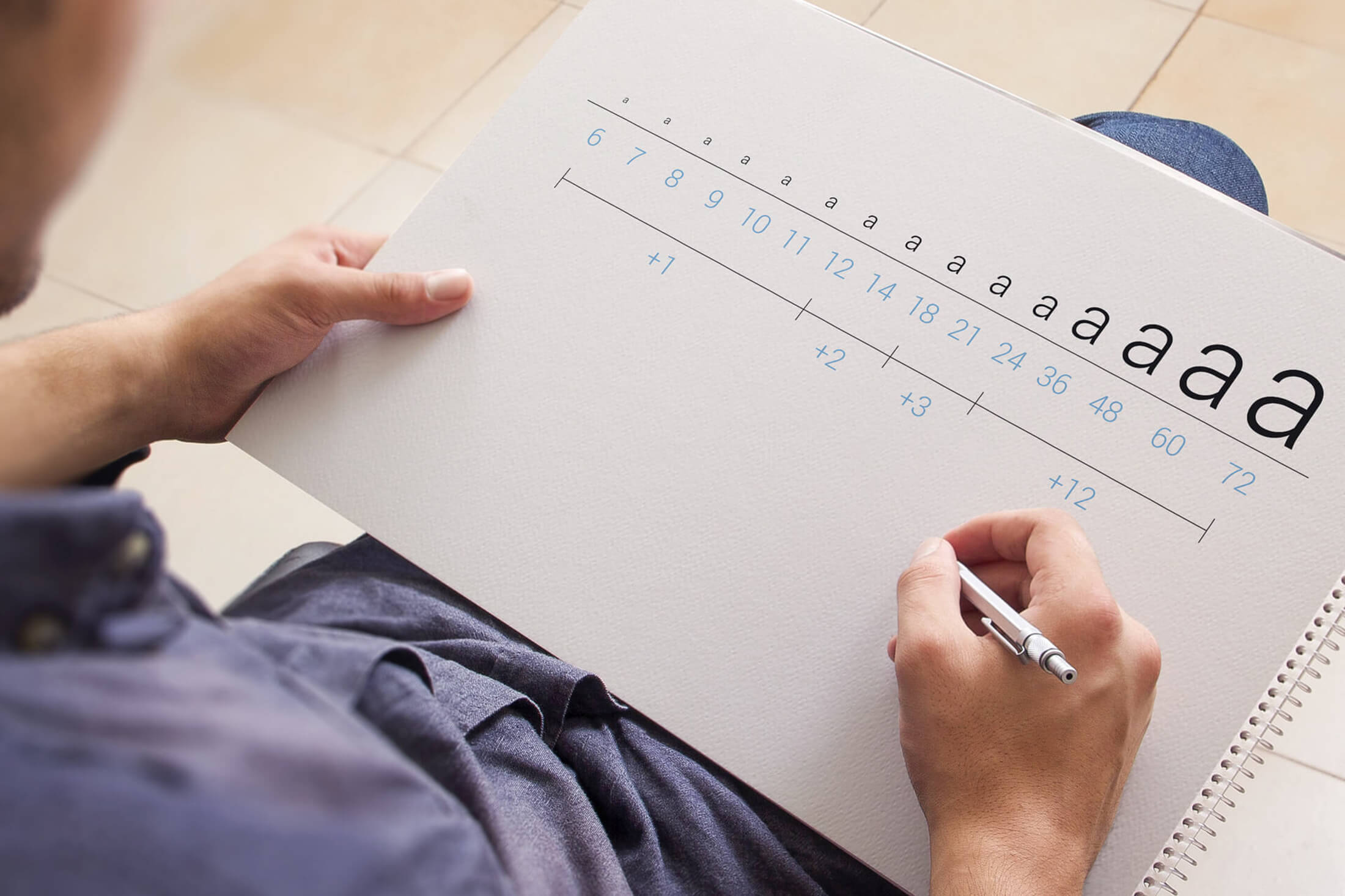
SIZE DOES MATTER - SCALE OF YOUR TYPOGRAPHY
The ideal size for text is 11pt to 12pt for body text, this makes it easy to read without taking up too much space. Headers can be anything from 18pt to 36pt, at these sizes, they draw the eye but don't distract too much from the logo or the brand.
Choosing the right font, size and placement is crucial. It can make or break the user experience on your website, your collateral and your brand. Experience is also just as key in this area, with many graphic designers spending a sizeable amount of time considering font options and pairings, and there is no substitute for having an experienced graphic designer or typography designer working on your design assets.
This should have helped clarify that typography is more important than many may think; it holds the key to a good user experience and reader retention. It can effectively make and break your brand.