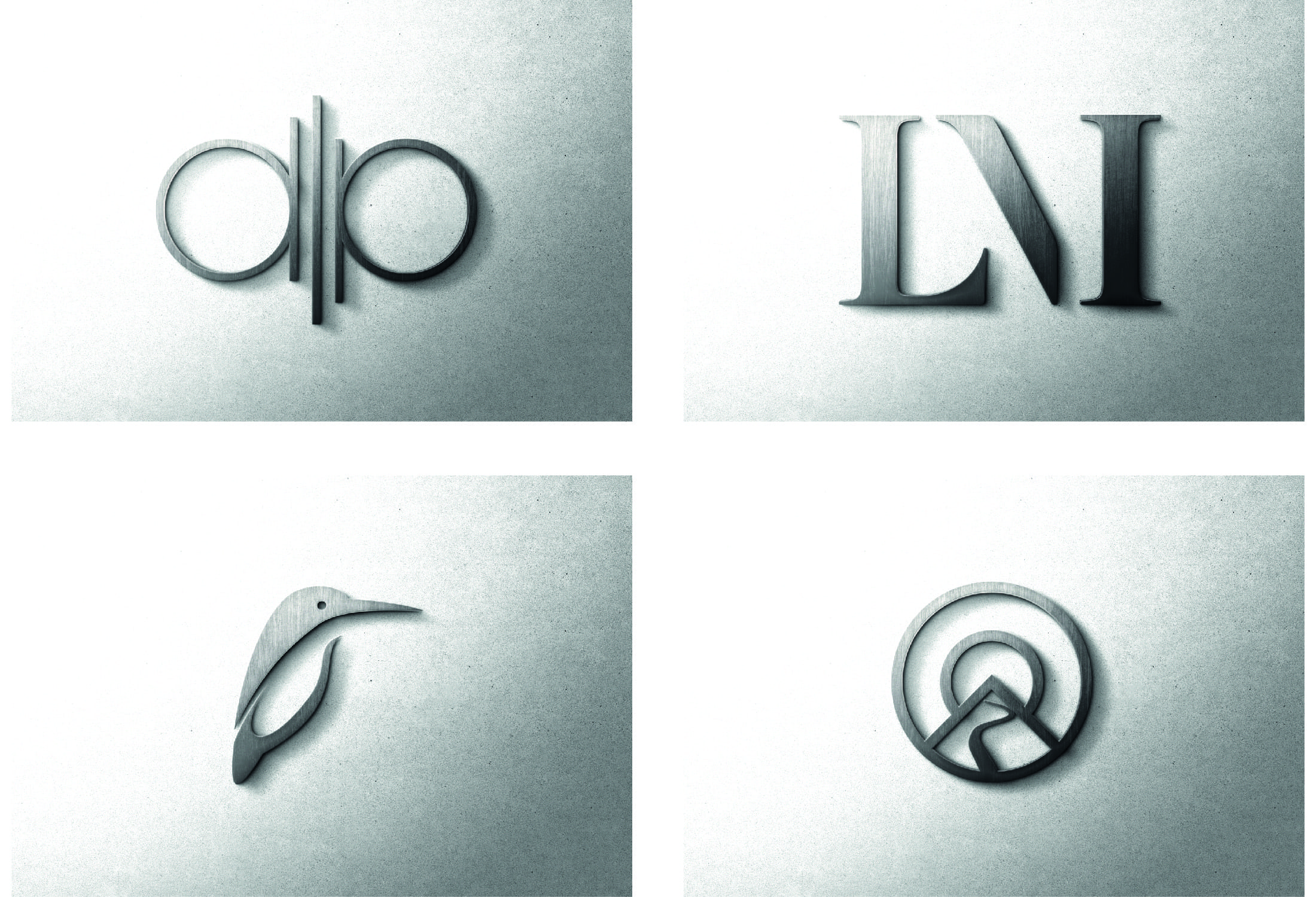
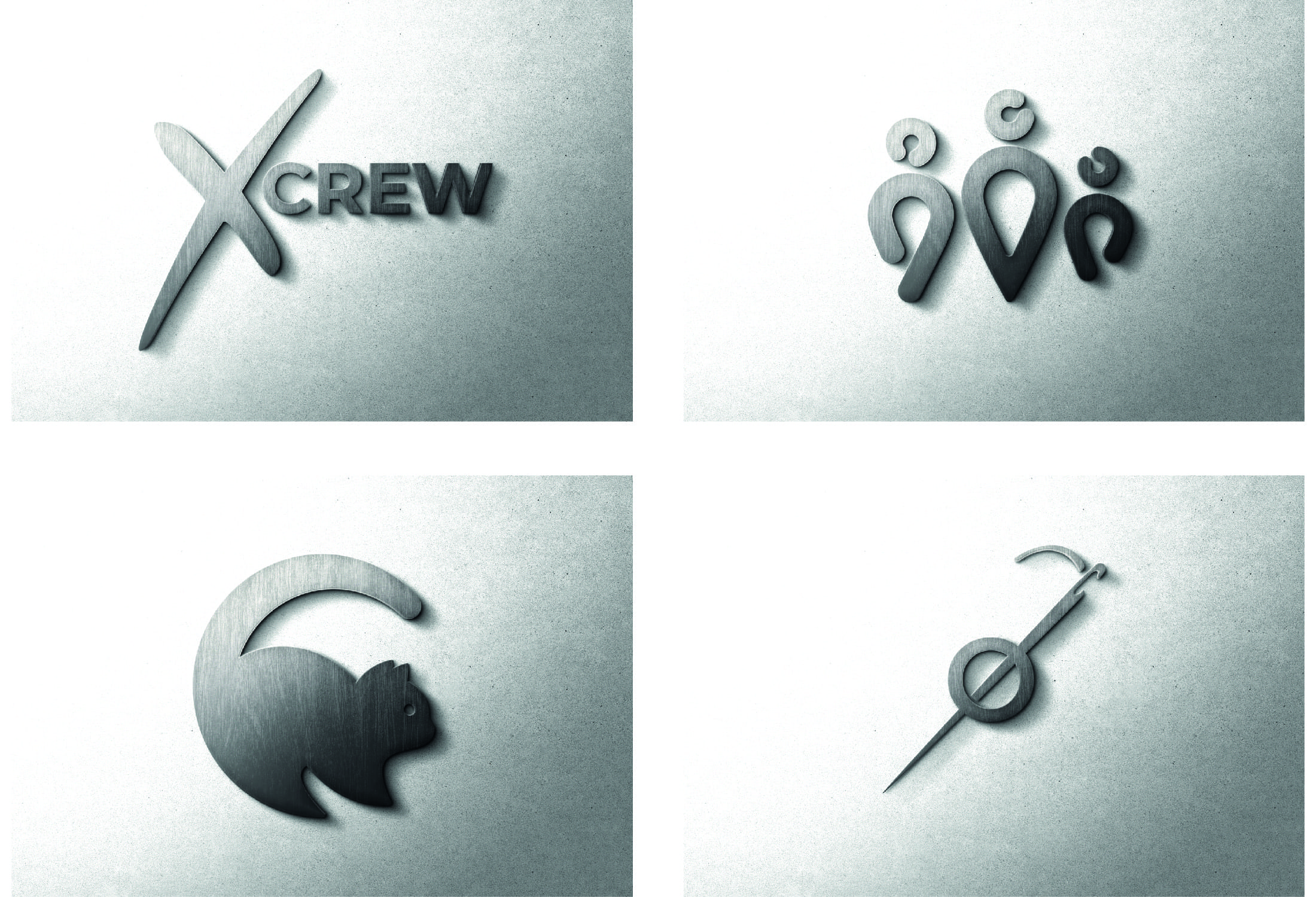
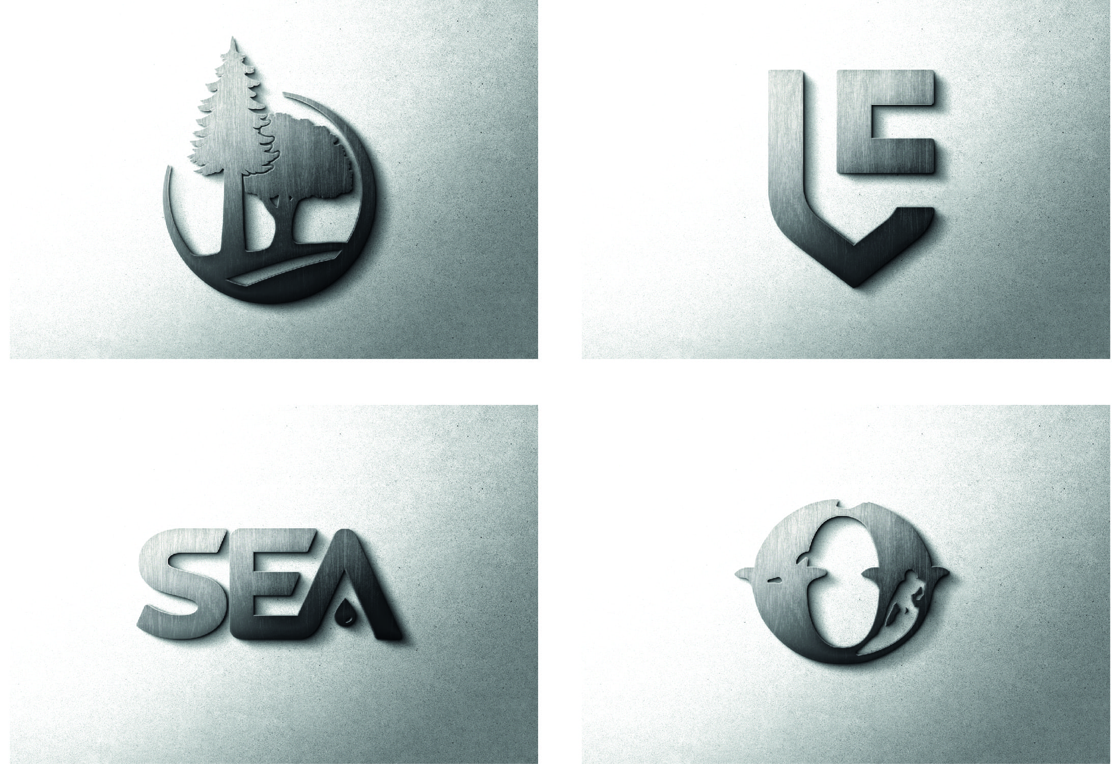
CUTTING BACK - THE MINIMALISM REVOLUTION
Less is more. It’s an old cliché, but it has become the heartbeat of an entire school of design.
The minimalist movement began as an act of revolt. Abstract expressionism had been sweeping through art and design for most of the 20th century, mass media was expanding at a rather alarming rate and consumerism was growing. Minimalism rose as an answer to the chaos, noise and busyness of the early modern design trends.
In the words of Hartmut Obendorf, an expert in user experience, product and NFT design, ‘reduction is the path to simplicity, and minimalism describes paths to approach reduction’1. Simplicity in design is often beautiful. Over-complicated, messy and busy design is almost always unattractive, and oftentimes incredibly difficult to use. ‘Form follows function’ became a mantra for the new minimalist revolution, believing that usability should be prioritised over aesthetic. This is not to say that easy-to-use websites and interfaces should look bad. Not at all! Instead, brilliant looking design should immediately follow easy usability. By reducing the number of colours, shapes, fonts and forms, the minimalists began to strip design down to its essential simplicity; preserving its fundamental nature, and becoming just as beautiful as it was effective.

There’s a big misconception, however, when it comes to minimalist design. Many people assume that minimalism is simply removing elements, throwing away a multiplicity of colours, using slightly thinner lines, or just putting everything on a white background. The removal of unnecessary features is, of course, a good rule in this kind of design, but there’s so much more to it than just that. While the rules of minimalism may seem rather straightforward, Dunja Sretović, a design blogger, explains that ’polishing the skill of telling a lot by saying a little is a process that takes years of exploration and practice’2.

THE FUNDAMENTAL ELEMENTS OF MINIMALIST DESIGN - KEEPING IT SIMPLE
Simplicity is a fundamental part of minimalist design. It can guide the observer’s eye, leading them to pay attention to certain ares, helping them to understand the design. The fewer elements there are competing for their attention, the better the chances that the onlooker will engage with the design in a desirable way. A good minimalist design is beautifully simple and easy to use. If any extra decoration, graphic element or extra words negatively effects readability or use, they should be replaced or removed.

VALUING THE NEUTRAL
Minimalism, as you can probably guess, endeavours to use a limited palate of colours and implores the designer to exercise caution when experimenting with the colour wheel. This doesn’t mean, however, that colours are entirely off limit. Few people are asking for black and white, or monotone, or boring designs. On the contrary, minimalist design can often be the most compelling and the most attractive. With a well thought-out use of contrast, complimentary colours and neutral, white space, designers can create striking graphics where vivid colours are used to draw attention to the most crucial elements of greatest importance.
This same idea should be applied when using fonts. Typefaces that are over-expressive, too fancy or rather aggressively curly, are to be avoided in a minimalist design. Combining different fonts should be done with care and expertise.
IT'S A BALANCING ACT
Harmony, balance and consistency are crucial watchwords when it comes to minimalist design. Making sure your graphical elements work together well and ensuring your shapes, colours, negative spaces and fonts are distributed across the design well, is what will set your design apart. It’s experience and an eye for detail that enables a good designer to create striking minimalist designs. To create something that balances simplicity and usability while still being beautiful to look at, is not something that is achieved in minutes.

BEING POSITIVE ABOUT NEGATIVE SPACE
One of the things that makes minimalism so unique and so eye-catching is its use of ‘negative space’. This is usually empty space and usually a block colour, or white. Negative space, when used effectively, can actually serve to accentuate certain aspects of the design, balancing out the graphical elements and creating a design that feels like a breath of peaceful fresh air in a world of noise, garish colours and chaos.
CREATING A HIERARCHY
All these factors already discussed work best when they’re used in a hierarchy. This creates a list of visual priorities for a viewer to follow. It tells them what information to look at first, then lead their eye to what you want them to see next, and so on. Colours, size, typography, and composition play huge roles in creating this hierarchy and drawing the onlooker’s eye.

Minimalism is a school of design that can be applied in almost every setting and medium. From web design to packaging design, minimalism works just about everywhere. Here at Stonefern, we have vast experience working in all mediums and with many styles of design. We can create bespoke, unique, eye-catching designs that work for your brand and make you look awesome.
1 Obendorf, Hartmut, Minimalism: Designing Simplicity, (Springer, 2009), Preface 2 Sretović, Dunja, ‘Less Is More, or How Minimalism Changed Graphic Design’, April Studio on Medium, (September 20th 2019)
