SHAPING YOUR BRAND - THE PSYCHOLOGY OF SHAPES
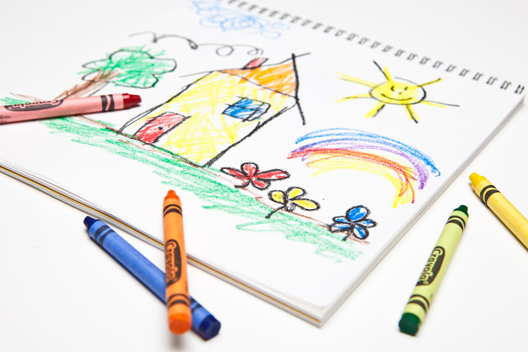
Have you ever watched a child draw a picture? Usually, its just a mismatch of colours, lines and some deeper message that only they can seem to see. And yet, there comes a time in every child’s life that they exchange the random squiggles for straighter lines and a slightly greater amount of coherence. They might start with a rectangle. Then, to really push the boundaries, they might draw a triangle on top of that rectangle.
Now, somehow, every single human recognises what it is that they are drawing. Without asking the child what they were intending to draw, every human now understand that this picture is of a building of some sort. Probably the house the child lives in. How is it that with two shapes, and six lines, the child has now elevated their art to something recognisable and understandable? How is it that just two shapes make an image that all people can connect with? This is the power of the psychology of shapes.

THE MESSAGE OF SHAPES
This power is something that your design can, and should, tap into. It’s probably never entered your mind to wonder what message the shapes in your design are conveying. We can understand that fonts send a message, and we’ve written previously about how colours are more powerful than we might realise. Of course, it is obvious that the wording, name and logo will all portray a certain meaning. And yet the shapes we use in our branding, product design or collateral can also put across a certain message. Let’s run through a quick list of shapes and what they mean.

RECTANGLES AND SQUARES
It’s probably best to start with the most commonly used shapes. You see them everywhere, in technology, furniture, books, magazines and in countless other places. The straight lines and right angles of these shapes convey a sense of security, strength and reliability. This is usually because, as the child’s drawing illustrates, most people associate these shapes with buildings. Subconsciously, it must be said.

TRIANGLES
Triangles are an interesting mix of energy and stability. Simultaneously, triangles can represent motion and direction, and balance and strength. The lines of a triangle naturally draw the viewer’s eyes to the top, meaning that automatically represents vision, direction, motion, risk, and in some cases, danger. The second meaning comes depending on the orientation of the shape. An upright triangle brings a sense of stability, strength and structural integrity.

CIRCLES AND OVALS
Circles have long been associated with the universe, with the sun, planets, endless time and magic. They are ‘soft shapes’, without angles or corners, meaning that they are the perfect choice to represent community, inclusivity, unity and love. Circles are usually seen as a positive shape.

BEAUTY IN NATURE
Most have heard of the ‘Fibonacci sequence’. It is one of the most famous mathematical formulas, and is often known as the ‘nature’s secret code,’ or ‘nature’s universal rule.’ It acts in nature as a kind of underlying, universal grid. For example, the nautilus shell is one of the most obvious and striking examples of this sequence, adhering to the spiral the sequence creates almost perfectly. For thousands of years before men even considered graphic design, before the artist picked up their brush to paint their masterpiece, before the inundation of file format acronyms and colour palettes, before art as we know it, nature was growing and flourishing in the most beautiful of designs. As we humans tend to do, we have created systems and sequences to understand the inherent beauty of the natural world, in an attempt to harness it, to reflect it, to try and bring a flavour of natural beauty into our designs.
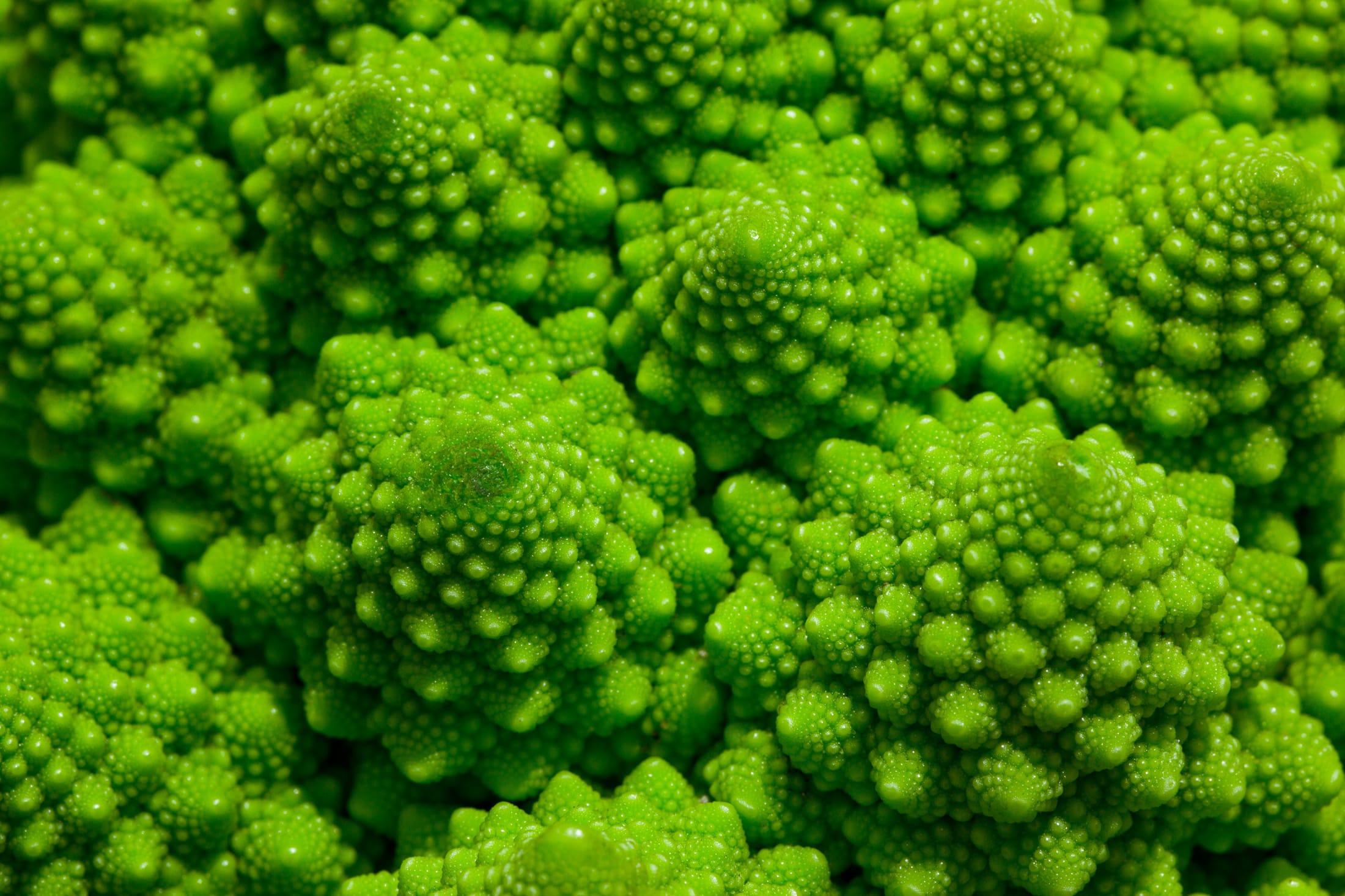
This is not a negative endeavour, instead, it should be commended and pursued. Like the Fibonacci sequence, nature tends to create designs that we naturally find pleasing, satisfying and appealing. If we can learn to reflect just some of the beauty of natural design, we can elevate our product design, logo design, websites, collateral, and all other forms of printed and online media, to becoming naturally appealing to the onlooker, inherently pleasing to the eye and more effective for public engagement. At risk of sounding like an out-of-time hippie that stumbled in from the sixties in all their garish glory: nature is all around us. Take it in. Steal a moment to look around and learn something from our natural world. (like in the broccoli below!)

This is just a short introduction to the fascinating world of shapes and their psychology. We haven’t even touched on some of the wackier shapes: like spirals that represent creativity, natural shapes like leaves that represent refreshment, and abstract shapes that can symbolise difference, a duality of meaning or unpredictability. When choosing shapes for your design and branding it is helpful to keep these things in mind. You want to present yourself in the best way possible, not conveying anything you don’t mean, or giving across an image you’d rather not.
To return to the illustration of the child’s drawing, the artist-in-the-making might not understand the deeper meaning of the shapes they are using. They may not even know that they are drawing a building when they use those shapes. But we do. Here at Stonefern, we can help guide you through the design process, to choose the perfect shapes to best represent your brand. With years of design experience, and a quite outstanding, adult, knowledge and understanding of shapes, we can help you create a brand that conveys the right messages and stands the test of time.
