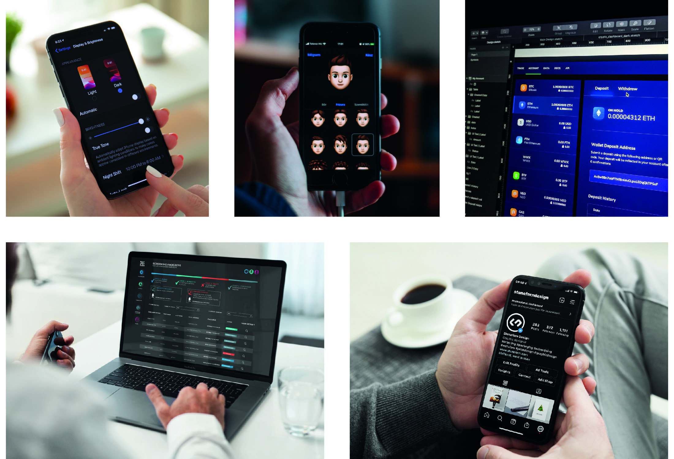
THE RISE OF THE DARK SIDE - DARK MODE IN UI DESIGN
One of the final things Yoda murmurs to Luke in Return of the Jedi is, 'Once you start down the dark path, forever will it dominate your destiny’. For UI design, it’s been very much the same story. Dark mode has actually been around for longer than many people realise, with the original computers using dark mode as default; screen illuminating technology couldn’t yet light up the entire screen without burning out. It’s never really gone away. In recent years, it has been making an unstoppable rise to being one of the most popular user interface preferences.
Dark mode design usually consists of light text on a dark background, inverting the usual black text on white background. A dark theme can be sophisticated, elegant and powerful, and can be an effective option in your website or app design.

THE ADVANTAGES OF DARK DESIGN
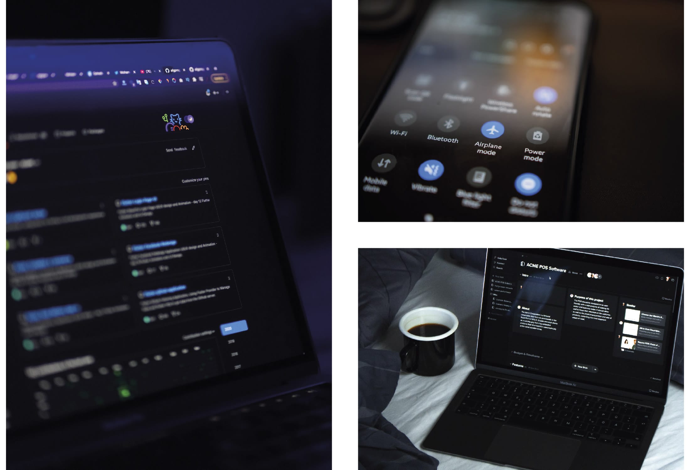
Dark mode design has some powerful practical benefits as well as looking great: focus can be improved, eye strain can be reduced and, according to experiments done by Mobile Enerlytics, dark mode can actually help save battery life. These are all bonuses to the design, and, when done well and used effectively, dark mode can be a brilliant addition to your UI.
You have to take into account context and content, but dark mode can be incredibly striking and dramatic. It can be strong, creating a sense of style, luxury and elegance; it can be effective for creating a feeling of futuristic professionalism, sleekness and authority. Dark mode can also help focus and direct the user’s attention to certain buttons, menus or texts, with minimal distractions. It also lends itself to supporting visual hierarchy and information architecture with great effectiveness.

COLOUR AND CONTRAST
Dark mode themes are probably better thought of as ‘low-light’ themes, because their backgrounds don’t always have to be black. The main concern is creating enough contrast to allow the text or design elements to be easily visible. Dark greys and blues usually work best, as they can create a wide range of depth, which helps with elevation, spacing, and forming a visual hierarchy. Greys are also incredibly versatile when it comes to colour pairings, and drop shadows work much better on grey than on black.
Some of the most important elements of dark mode UI design are the colours you choose. Best practice is to avoid heavily saturated colours, as they can be difficult to read on darker backgrounds. Or, if they are lighter colours, the contrast can sometimes be too strong, making the colours vibrate and become painful to the eye.
For example, royal blue on white looks great, but royal blue on a dark background would be practically illegible; bright yellow on pure black can be too strong, but a slightly less saturated yellow on a dark colour other than black, can be very effective.
A major concern when choosing your colours is the message they communicate. For example, turquoise on a lighter background can be summery and playful, whereas the same turquoise on a darker colour can be striking and futuristic. Your colour palette has to send the right message to the onlooker. Most colours work subconsciously, with people understanding that warmer colours (like reds, oranges and yellows) usually mean energy, action and excitement, while cooler colours (like blues, greens and purples) are usually calmer, more peaceful and soothing. The contrasting colours become the focal point of the design, so making sure they’re communicating the right message, that’s on-brand and consistent with your agenda, is vitally important.
TYPOGRAPHY AND TEXT
Every piece of text in a dark UI design is under supreme scrutiny, sometimes even more than in light design. There are two concerns here: legibility and contrast. The text needs to be big enough to work on the darker colour, as smaller text is more difficult to read the darker the background becomes. In this way, it’s never usually a good idea to have long-form body text, like blog posts or articles, on a dark background. Whereas titles, buttons, icons and calls to action work exceedingly well.

You also need to take into consideration the fonts you use. Using fancier serif fonts, unless in big titles, can often be problematic as the thinner lines can get lost in the contrast. Sans serif fonts work well, thicker lines and fuller typefaces help increase contrast and readability.
Ultimately, dark mode UI design is in most cases an entirely personal, aesthetic choice. You need to consider whether it works with your brand, your message and your goals, whether your content, products or services fit with this style. Whatever you decide, the biggest thing to remember is that designing good dark mode themes is difficult. It takes skill and expertise to create something that looks great, works well and still conveys your brand message. At Stonefern, we have experience working in a wide variety of design styles and themes. We can create powerful and bespoke dark mode UI design themes that are striking and effective.
