
A (VERY) BRIEF INTRODUCTION TO COLOUR THEORY AND WHY DOES IT MATTER SO MUCH?...
What is your fabourite colour? You’ve probably been asked that thousands of times before. But have you ever thought about how that colour makes you, and others, feel? What impression that colour gives, or what emotional response that colour might effect?
This is the basis of ‘colour theory’.
In the words of Russian artist and thinker, Wassily Kandinsky, ‘colour is a power which directly influences the soul’. This is no different in design. Whether it is the impression your brand gives at a glance, or the feeling a customer might get when looking at your branding or website, colours play a huge role in shaping how a potential client might interpret your brand.
REINTRODUCING COLOUR
Ever since 1666, when Isaac Newton invented the colour wheel, artists, designers and ‘art theorists’ have used the wheel to create colour harmonies, to effect certain emotional reactions, or to make mixes and palettes. What Newton designed, just before the infamous apple fell on his head, was an early version of the colour wheel that many might remember from their childhood.
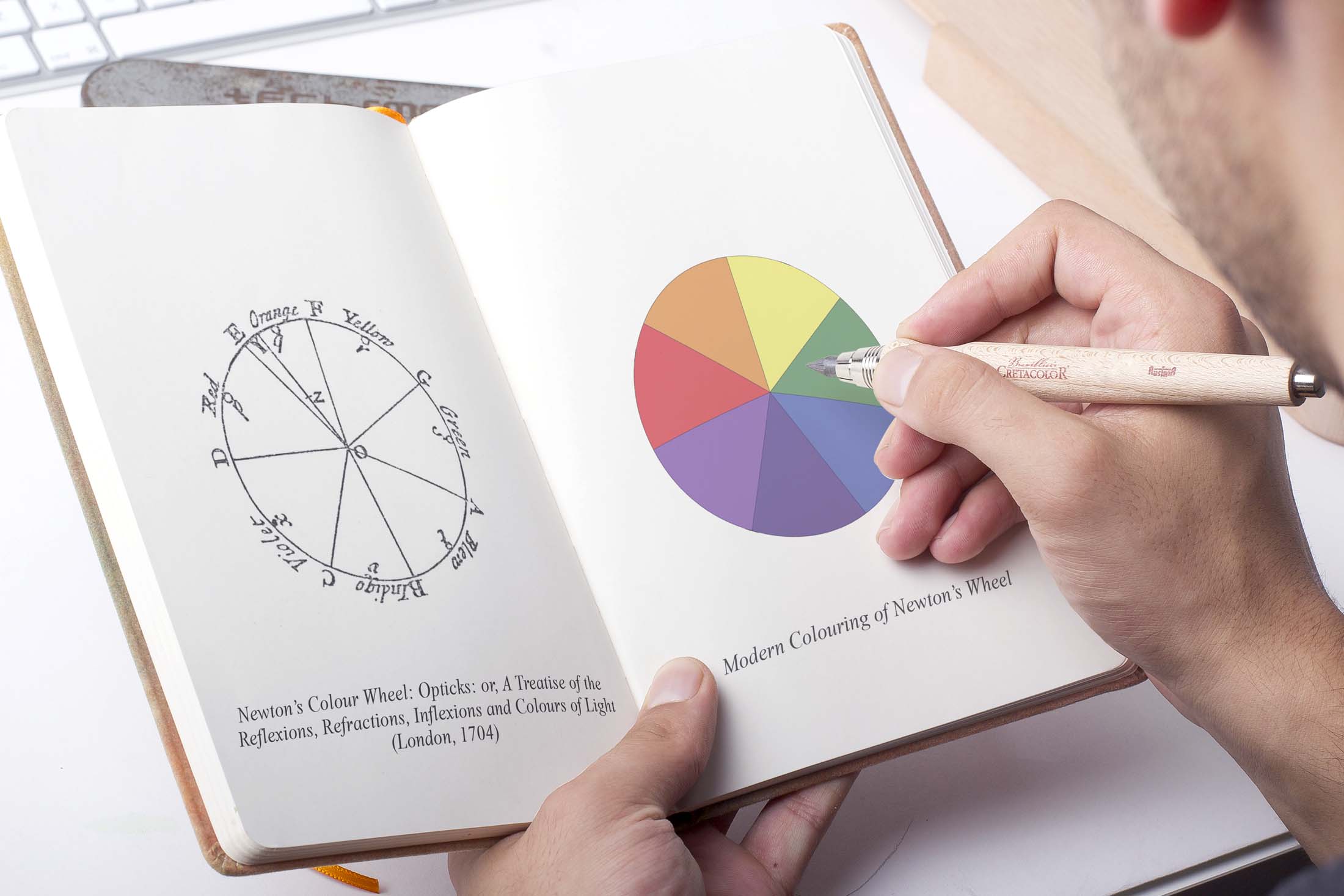
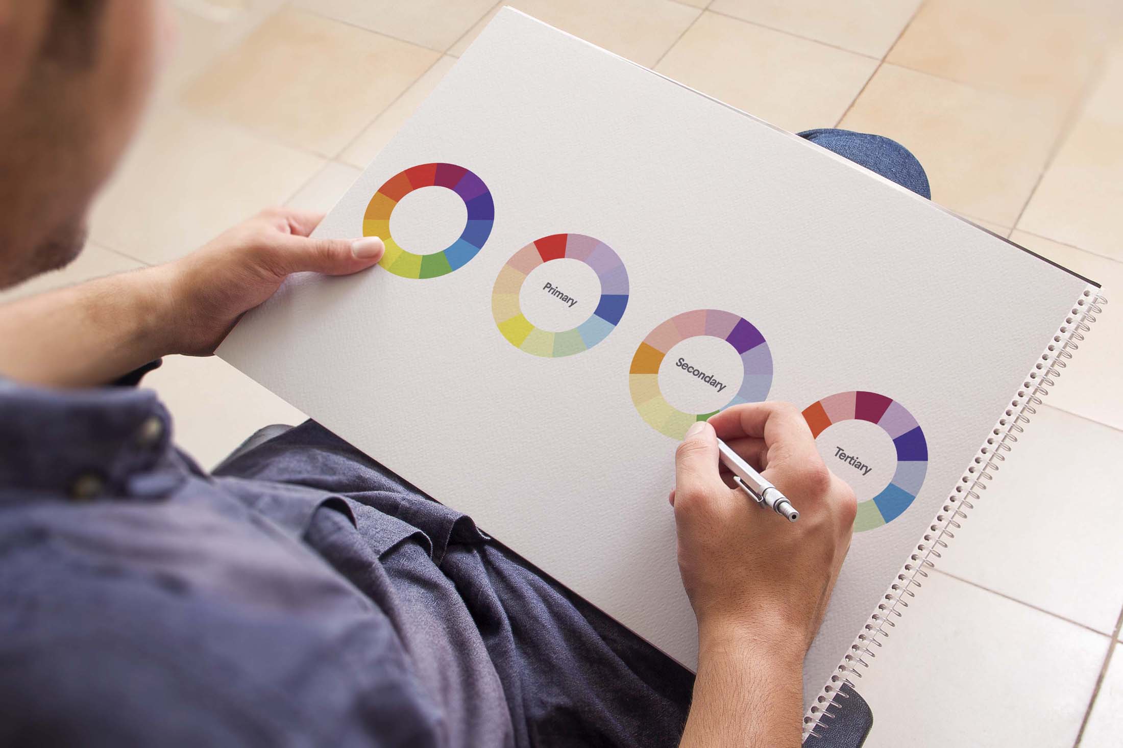
While Newton’s wheel may look rather simplistic, the basics still stand. Nowadays, a few more shades have been added, giving us the categories of ‘Primary’, ‘Secondary’ and ‘Tertiary’.
These three categories can be split into two halves: warm colours and cool colours. The warmer colours (reds, oranges and yellows) are usually associated with energy, action, excitement or brightness. The cooler colours (the blues, greens and purples) are usually seen as calmer, more peaceful and more soothing. Once we understand the ‘temperature’ of our colour choices, we can better understand how they might effect the presentation of our brand.
EXPANDING THE PALETTE
From the twelve colours on the modern wheel, we can expand our range to an almost infinite number of colours, all through ‘shades’, ‘hues’, ‘tints’ and ‘tones’. All these are variations of the original colours (or hues) on the colour wheel. A ‘tint’ is a hue with white added in (like red and white make pink), a ‘shade’ has black added to the original hue (like red and black makes burgundy) and a ‘tone’ is a colour with black and white (or grey) added; this addition darkens the original colour and makes it seem less intense and more subtle. By using these ‘shades’, ‘hues’, ‘tints’ and ‘tones’, we can put together ‘colour schemes’ for design standards, brand identity and marketing materials. Using the same colour wheels, we can easily identify which colours work best together.
There are three methods by which to do this

1 COMPLEMENTARY COLOURS
These colours are opposite each other on the colour wheel. For example: red and green, or orange and blue. These colours offer the greatest contrast to one another, creating eye-catching, sharp and impactful designs. A great example of this is the logo and branding for Fanta, that uses primarily orange and blue, colours opposite each other on the wheel. Overdoing this, however, can get monotonous; like the Christmas section at a supermarket that arrives too early and stays too long. So, using contrasting, complimentary colours should be done with some restraint and a little bit of finesse.
2 ANALOGOUS COLOURS
These colours sit alongside one another on the wheel, like red, orange and yellow. Usually in this colour scheme, one colour will be the main focus, with another supporting and another accenting. As can be well illustrated in McDonald’s branding. Not only do analogous colours please the eye, but they can also help instruct users, customers or viewers on where and how to take action. By using the accent colours for buttons, links or menu items, it helps direct the user on how to navigate your website.
3 TRIADIC COLOURS
Triadic colours are those colours evenly spaced from one another on the wheel. They are usually bright and eye-catching. What these colours do, as can be seen in the Burger King logo, create contrast and harmony almost simultaneously. This makes each individual element stand out, but brings them all together in a pleasing and engaging way.
SO, WHY SHOULD I CARE?
This sounds great as a theory. But, practically, why does it matter? By understanding colours, how they work together and how to pull together powerful colour schemes, you can better present your brand and be better equipped to make effective branding decisions. Colour theory helps you to avoid the hellish mismatch of random colours that causes physical pain to the onlooker, and helps you to choose those colours that best represent your brand and illicit the best response from the viewer.
As colour works mainly subconsciously, not every potential customer will have an understanding of colour theory, and this gives you an advantage. You’re able to form how the customer responds to your brand, without them even knowing, through the colours you choose. So, this has been a very brief introduction to colour theory. Use this information wisely. With great understanding of colour comes great branding decisions!