
WE GET SENT ALL KINDS OF BRIEFS FOR ADVERTS
Anything from ATL campaigns to Mrs. Davies wanting an advert for the local flower show. Whatever the brief, budget and audience though there are some simple design rules anyone placing an advert should follow.

AUDIENCE
Always sell to your customers and never to yourself - it is all too easy to get caught in the 'my wife, postman, neighbour, dog doesn't like it' trap - you must always remember that you are designing for your audience.
BRIEF
Unless you have complete faith in your designer don't write a 10 second one-line email brief. You will always get out what you put in and remember, design can be highly objective but the message should always be as clear as day!
SCALE
Go big or go home - In print advertising, size is important. A larger ad draws the eye and can generate more leads. It also allows you to include all the important information without appearing cluttered.
IMAGERY
When using imagery ALWAYS choose strong eye catching relevant backgrounds but remember that text needs contrast to stand out. Choose images with well-placed high contrast areas to allow for message placement and clarity. Be prepared to edit your content to suit a really strong image - after all, no one will read your ad if it hasn't caught their eye in the first place.
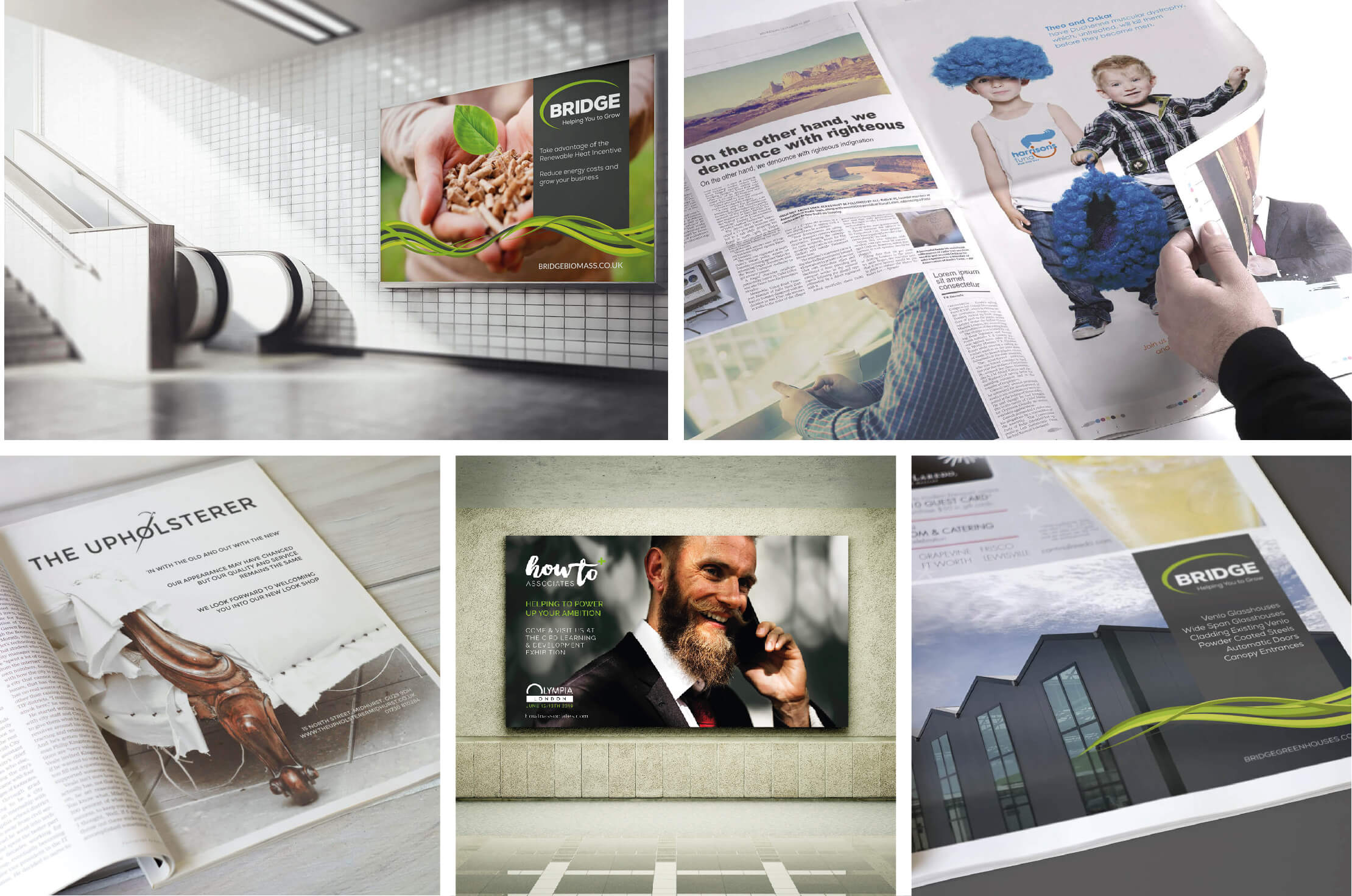
SOURCES
If stock imagery just won't get your message across and you can't afford a photographer don't be afraid to blend stock imagery from different sources. (the above advert image is three totally separate images combined) This is where a good designer can really help you out. From experience they can scour 1000's of images quickly and instinctively know what will work to make a great composite image for your ad.
CONSISTENCY
Consistency is essential - does the ad meet your brand guidelines, are your fonts, colours and messaging 'on brand'?

CROSS PLATFORM USE
Photoshop is great for photos but not for layouts - make sure your designer is working with vector files, that way scale will never be an issue - the same advert can be 5cm x 5cm or 50m x 50m with no loss of resolution.
EXPERIENCE
Listen to your designer, something might take them ten minutes but it took them 10 years to learn how to do it in 10 minutes, oh and remember any good designer always works to a hierarchy grid, don't go messing with it!
COMPOSITION
Finally - don't think of white space as empty space - its what focuses the composition and lets the design 'breathe' - always think - 'less is more'