
LANGHAMS BREWERY
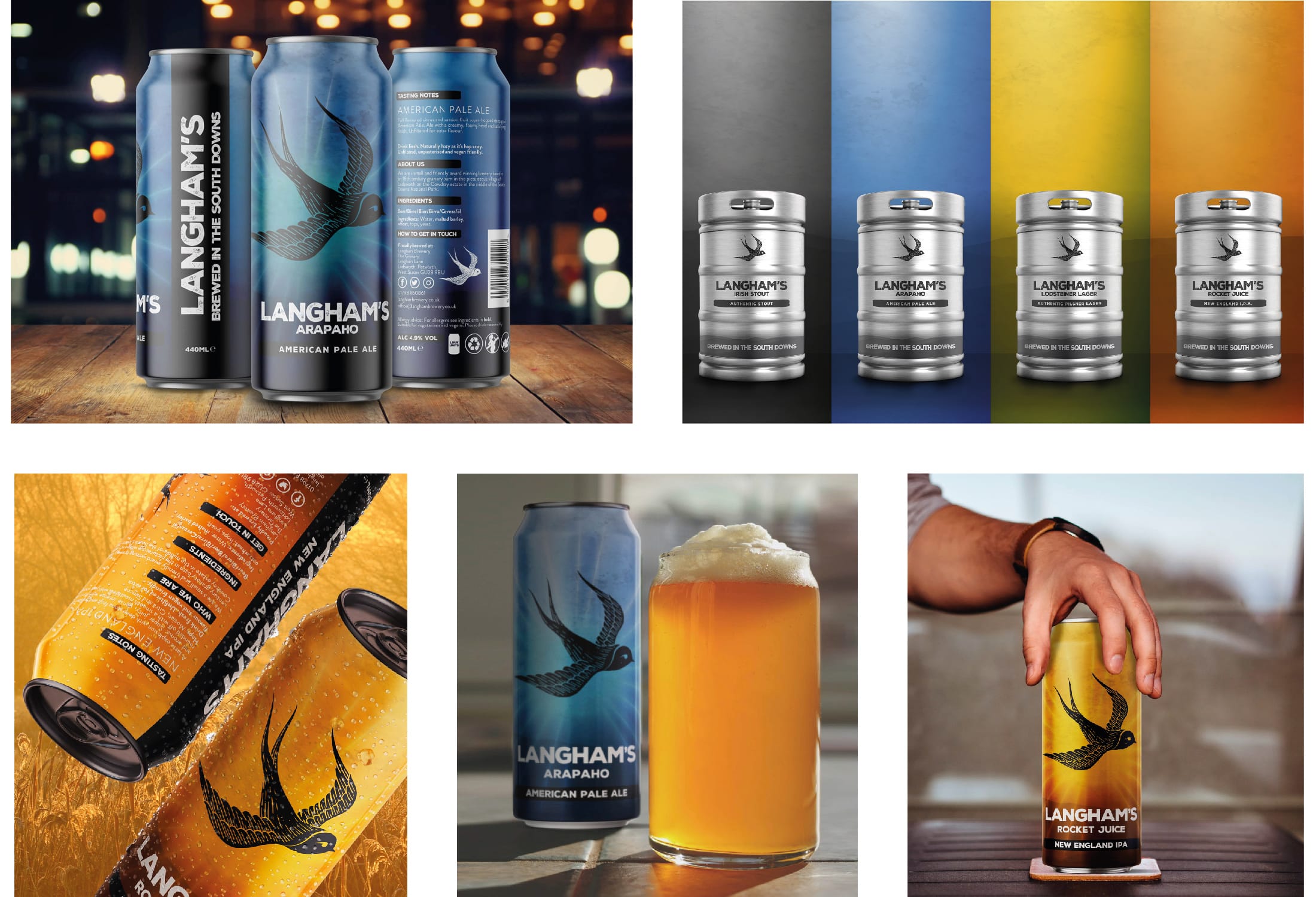
Lesley at Langham's approached us last year after a canning project they had been working on stalled. They needed a studio with experience at designing packaging and all the repro, shelf edge, consumer and legal knowledge that comes with it.
The brief covered 4 flavours within a range and it is was soon decided on a 'grunge' design direction. There is a lot of relevant research out there about how people are connecting with brands and their stories as people are really keen to ‘buy in’ to a brand if it has a genuine story and history they can relate to.
Brand locations (particularly in brewing) are of real importance to consumers and form part of a brands USP, giving it both placement and value in the marketplace. Consumers retain brand loyalty when given a true and honest story and location plays a huge part in conjuring up brand emotion. The packaging designs make a strong yet subtle reference to that location in the addition of the hills at the base of the can - this nod to location would be irrelevant without a back up statement so ‘Brewed in the South Downs’ is proudly displayed for shelf edge impact!
Lesley, who is a marketing director at Langham's was kind enough to say this about the project. "We love the grungy but colourful designs and attention to detail - we could not be happier”


