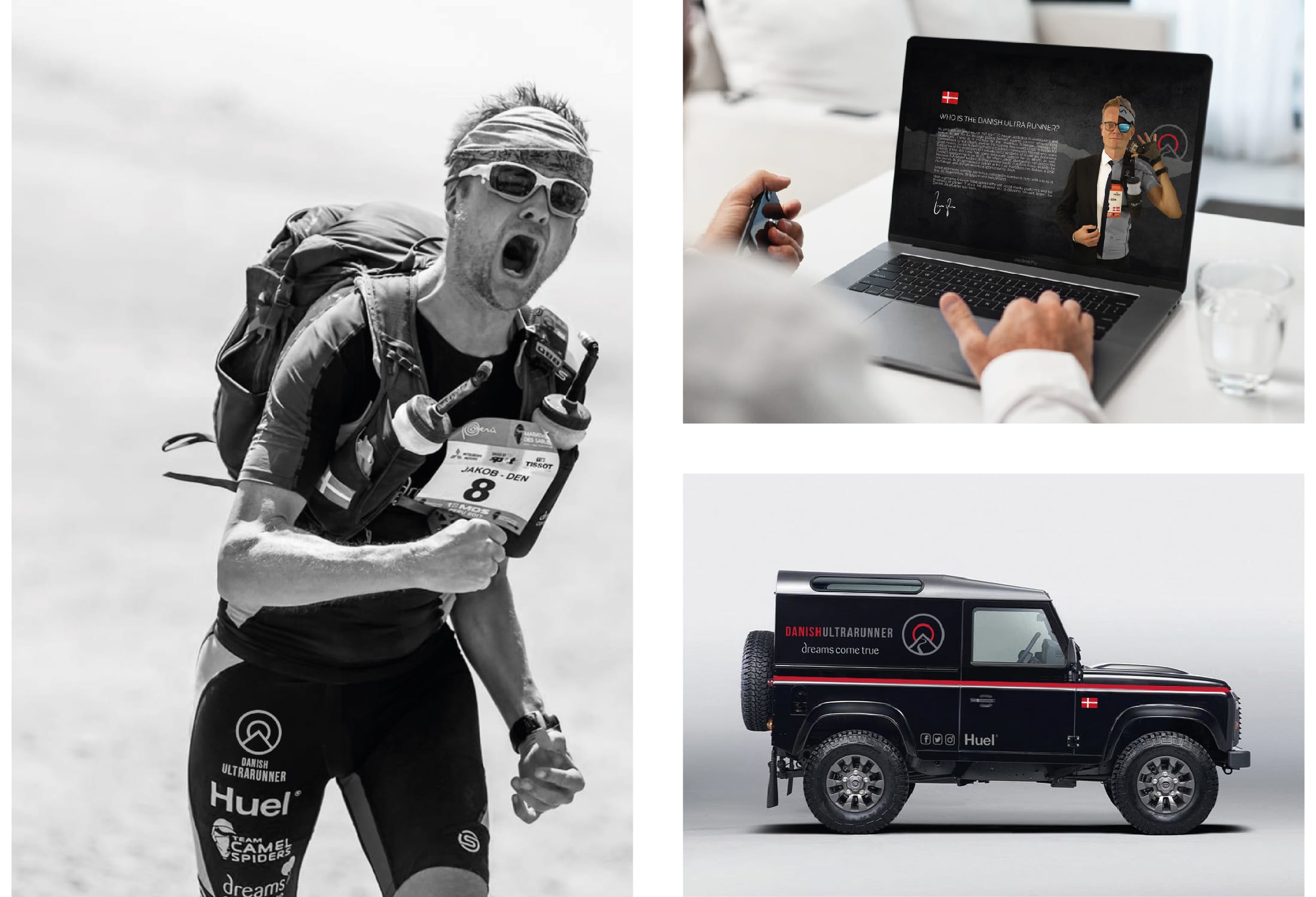

DANISH ULTRARUNNER
Jakob is the CEO of one of our clients and a huge part of his life is running Ultra Marathons to raise money for good causes. He had left his own personal branding to one side for many years in order to focus on his business but decided the time was right to raise the profile of his past and planned achievements in order to help raise more awareness and more funds for the charities he supports.
Jakob always has a clear vision of what he wants which makes him a great client to work for. In this instance though we had a really clear idea about how his logo should look and the story it should tell. The circle represents unity whilst the sun, mountain and road represent the challenge of ultra running. The final design combining these elements is a simple, clean and modern logo.
The list of collateral for this brand is endless, we are designing elements for Jakob for use on social media, web presence, clothing, livery, equipment, print, and digital resources such as promotional decks for corporate tie ins. The next 12 months should produce some really exciting design work for this client!
Jakob, the Danish Utra Runner was kind enough to say this about the project. "You think you've seen the final design and then they produce something even better! I could not be happier with the final product”