THE REBRAND OF FOOTBALL
When David Beckham said, ‘It's not about the name on the back of the jersey, it's about the badge on the front,’ he was touching on something more than just football. The badge comes to represent more than just a football club. The badge becomes the iconography of a lifestyle, an identity, a tribe. It transcends the bounds of commercial branding, leaving the pitch and becoming a fundamental aspect of the everyday life of the fan. As such, it is often world-shattering when a football club redesigns their badge. There are some clubs that have done this to great effect, and others that have flopped, hard. From the trial and error of the rebranding exploits of football clubs, we can learn some valuable lessons about the importance of branding, brand loyalty, and the importance of rebranding with care.

WHY ARE FOOTBALL CLUBS REBRANDING?
Design trends progress and evolve over time, and today, the standard is minimalism. Removing unnecessary text, using clean lines, simplistic imagery and coherent colours that convey meaning, are the rules to live and die by. For years, football badges have attempted to try and cram as much iconography and symbolism as they possibly can. For example, the 1993 Liverpool crest, redesigned to commemorate the Hillsborough disaster, or the 1999 Tottenham Hotspur badge.
This is usually because the club badges would be based on the town crest, with all the original symbols and icons. In fact, Liverpool’s original badge, adopted in 1892, was the city’s coat of arms, complete with the Roman and Greek gods, Neptune and Triton, as well as two Liver birds and a Latin phrase. As a coat of arms, it is compelling, but the details get lost as a club badge. Overtime, badges evolved to include football imagery, mottos or symbols representing events from the club’s history.
After the Second World War, clubs made a concerted effort to modernise their crests to be more on-trend with the new design standards. The International Typographic Style (a design style that used asymmetrical layouts, grids and sans-serif fonts) was growing, and with it, came an emphasis on ‘banishing ornaments’. This was the beginning of the more simplistic, cleaner, minimalist badges.
It took a step backwards in the 80s and 90s, with the traditional crest-badges seeing a revival. Promoting nostalgia, these badges emphasised the history of the clubs and the connection the modern fans had to it. It was the understanding of legacy, and the importance of placing yourself in the tradition of the club; it reinforced loyalty and pride in the rich heritage of the club.
As design trends evolve and change once more, we have seen a shift back to the minimalistic and simplistic badges. The last decade has been the era for removing the garish, bright colours of the traditional crests, minimising intricate designs and bringing in clean lines, minimal text and simplified iconography. This modernisation also allows the badge to become more than just a shirt emblem, it can become a logo. Having a stylised identity can boost commercial opportunities, with a simpler logo looking cleaner, and more fitting, on clothing, active wear, or other branded products.
Nowadays, you’ll be hard-pressed to find a club badge as intricate or complicated as some of the traditional ones. Let’s take a look at some that achieved this rebrand with success, and some that really didn’t.

THE BALLON D'OR OF BADGES
To rebrand something as beloved as a football badge is always a risky business; to take something so iconic and redesign it into something new, is often a jump into the dark. And yet, there are some clubs that have taken this leap of faith, with astounding success.
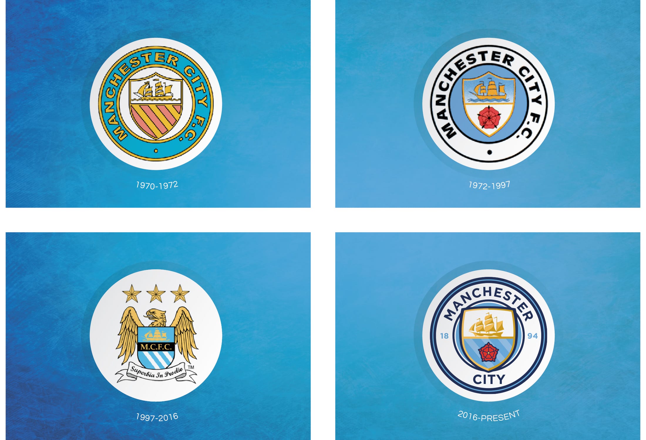
Just one example is Manchester City. In 1997, they introduced a new badge: an eagle. Based on an old Mancunian heraldic symbol, City incorporated their traditional ship and rose symbols, over the new eagle. This badge become beloved by fans, especially after they won their first premier league in 2012. In 2016, it was time for a rebrand. Instead of reinventing the wheel, the designers decided to draw on the heritage, tradition and legacy of the club, bringing their history to the present and emphasising their deep connections to the fans. Combining design elements from their original 1930s badge, with the colour scheme of the 1972, they created a crest that was destined to become a fan favourite.
This is a rebrand done well, and we can learn from it. Sometimes, its not about doing something new, innovative and groundbreaking; sometimes less is more, and drawing on your brand’s heritage, history and its connection with the market and customers, can create something fresh but iconic. You can call on the brand loyalty you’ve already established, breathing new life and light into it.

SCORING AN OWN GOAL!
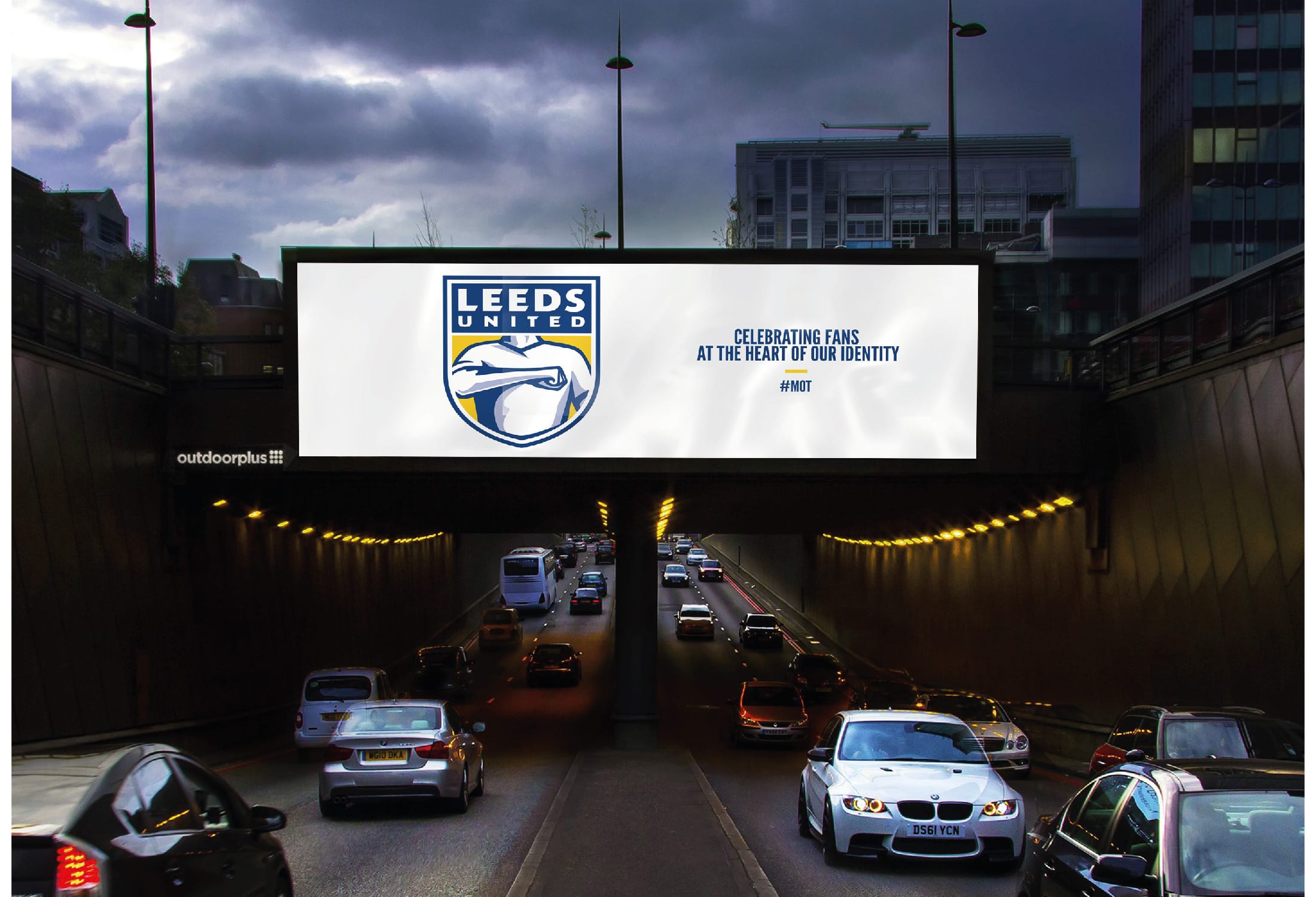
And yet, there are some clubs that haven’t fared too well. The biggest example is Leeds United. In 2018, Leeds unveiled their new badge to celebrate their centenary. Apparently, it took them six months of research, consulting 10,000 people, to come to the new design. Let’s just say, it wasn’t met with the response they were hoping for. They faced immediate backlash, with fans astonished and appalled at the new design. There was no semblance of the original crest, the only element they carried over was the colour scheme.
Over 77,000 supporters signed a petition to stop the launch. Even other clubs got in on it, with Aston Villa mocking the rebrand. Comparisons to the Gaviscon logo were made, and the fans became increasingly infuriated.
The club made a u-turn, officially stating, ‘We conducted thorough research into the desire for a change to the crest to symbolise a new era for the club. However, we also appreciate the need to extend the consultation with supporters and we are committed to working with you to create an identity we can all be proud of.’ In the end, the club decided to make a small update to the original badge, going for an all-gold finish and a celebration of their 100 year heritage.
So, what can we learn from this absolute howler of an own goal? One of the most important things about rebranding is to keep your audience or fans onside. It seems that the fans didn’t think that Leeds had consulted enough people, or done thorough enough research. If your brand has an international reach, you might want to keep that in mind when consulting a small focus group and acting on their advice.
In line with this, keeping your customers or fans up to date with the rebranding process is key. Bringing them along on the journey allows them to feel as though they are a part of the process, and avoids any unnecessary surprises further down the line. Holding review points, keeping them abreast of decisions and ideas, builds a sense of collaboration with your audience, and keeps them onside.
Another thing you need to keep in mind is that your brand is not entirely your own. As soon as customers, clients or fans use your products or employ your services, they build an emotional connection to the brand, and it becomes more than just a logo. Building brand loyalty is key, and understanding that people can create strong emotional ties to your company is a fundamental factor in navigating a successful rebrand.

FULL TIME THOUGHTS
Rebranding is a journey, one that is often marked by learning curves and trial and error. But, don’t be afraid to take that leap. If you feel like your brand is waning, or your company is beginning to dry out, a rebrand can be a highly rewarding process that can breathe new life into your business or product. Here at Stonefern, we can be your guide along this process. Whatever your project or budget might be, we can provide high quality, creative solutions to all your needs. As our team is entirely scalable and comprised of incredibly talented individuals, we are able to keep our overheads low and be more competitive than larger agencies whilst still delivering a quality product and service. We pride ourselves on fair, realistic, cost effective and transparent pricing and instilling from the get go absolute confidence that we’ll get the job done.
