
CONFUSED BY DESIGNER SPEAK? - THEN THIS ARTICLE MIGHT HELP!
Much like the guy who says, ‘no, it needs to be .pdf not .doc, with tighter kerning and increased leading, and, of course, in warm analogous colours, Pantone is preferable… Oh, and have you checked for those pesky widows and orphans?’, designers can sometimes be hard to understand, especially if you come purely from the client side. Never fear, help is at hand and (hopefully) you will be better placed to understand and get the most of your designer.
THE MANY FACES OF FILES
JPEG, TIFF, PNG and BMP, CMYK, PMS and RGB, AI, PSD and PDF. Got that? No? Right, well, time to get to work. All these acronyms, and many others, are all kinds of file type, some for images and documents, others for colours and artwork. While it may look like some snobby web designer from deepest California has dropped a Scrabble box and had an epiphany to confuse everyone, each collection of letters holds a myriad of information. Each as important as the last, each specifically created for different tasks.
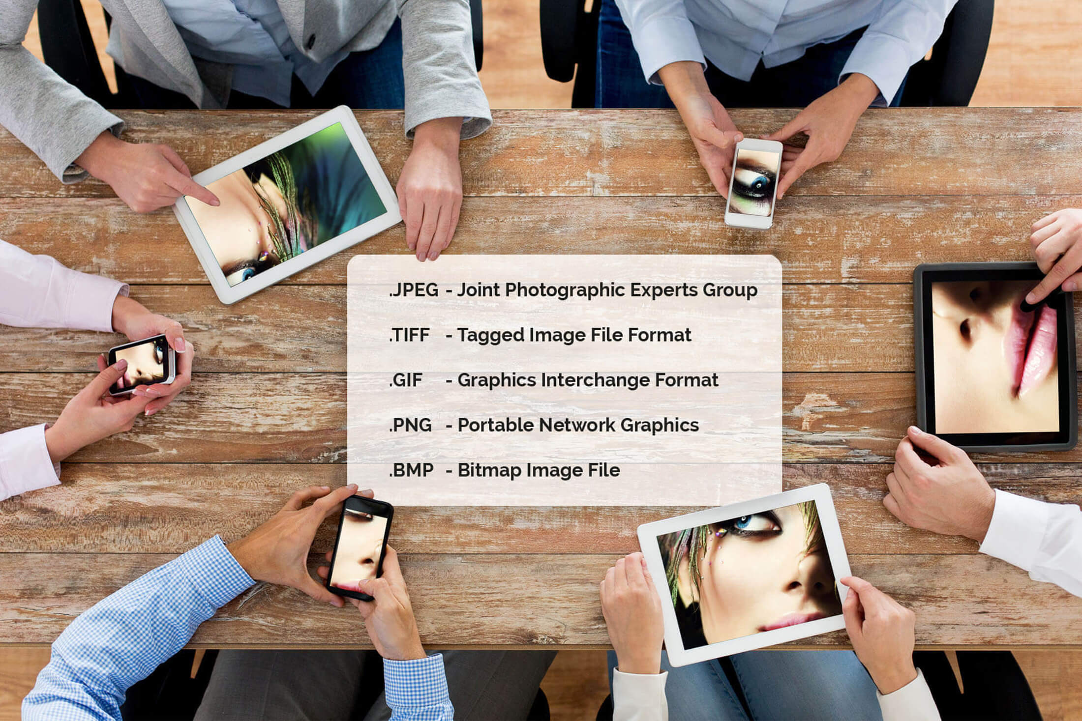
WHAT IS THE DIFFERENCE BETWEEN A JPEG, TIFF, GIF, PNG AND BMP?
JPEG files are the most commonly used image format, supporting 16.7 million colours. They are also usually smaller as its ‘lossy’ (using inexact approximations and the discarding of partial data, making it smaller while retaining the quality) compression reduces the file size.
TIFF files are similarly for images, but uses a non ‘lossy’ compression technique, meaning that no quality is lost. The major difference, therefore, is that a TIFF is a much bigger file. Unlike a TIFF, if one was to edit or process the JPEG, one would notice that, as more data is lost, and gets magnified, it becomes a lower quality image. Whereas a TIFF can undergo many more processing runs before signs of degradation begin to appear.
GIF files are (pronounced ‘gif’ like ‘gift’ not ‘jiff’. Just to clear that up) as you have probably recognised, a staple of social media and of millennial use of the world wide web, as they can house animation and transparency, unlike a JPEG. However, a GIF, where it gains in animation opportunity, it loses in quality and colour integrity. GIFs tend to only contain up to 256 colours, unlike the 16.7 million of a JPEG. While this makes it a poor choice for photos and large images, it makes it perfect for things like clipart and text-based images, where fewer colours are involved.
PNG files are like a GIF’s fitter older brother, with the use of 16 million colours (called truecolour), meaning that it can be used for editing photos and and doesn't lose its quality over multiple saves, all the while keeping the ability to have animation and transparency. It is good as it has a relatively small file size for its content, however, some very old internet browsers do not support it.
BMP files are Bitmap Image Files, where the creators disregarded the second and third words in its name, opting to make an acronym of only the first. Makes sense. Seriously, a BMP is a Windows-specific file format, which means it can be used for many Windows applications, but is let down by its enormous file size. Without using compression, and with 24 bits-per-pixel, the BMP can deal with high quality images, having the size to prove it.
Put simply, a JPEG is most commonly used, is the smallest and best for photos. A TIFF is similarly good for photos for print, but is disadvantaged by its larger file size. TIFF fares better under processing than a JPEG, so for photo editing (and using as the original file) it is the better option. A GIF is a relatively low quality file, with its main uses being for clipart and text based images. Similarly, a PNG does this, just better, with more colours and a relatively good file size for what it holds. Lastly, a BMP is only for use in Windows, but even so, its generally too big to use effectively.

WHAT IS THE DIFFERENCE BETWEEN CMYK, RGB AND PMS?
CMYK = Cyan, Magenta, Yellow, Key (key simply means black). They are displayed as a series of four values ie. 34.45.23.90
RGB = Red, Green and Blue. They are displayed as a series of three values ie. 129.45.230 or as a web reference which is a combination of letters and number ie. #FFFFFF
PMC\S = Pantone Matching System. They are displayed as a reference ie. Pantone 337C (the small 'c' standing for Coated)
As you've most probably realised, all these acronyms have something to do with colour. We’ll start with CMYK and RGB. Both of these are colour modes; RGB for screens and CMYK for print. RBG is called an additive colour mode as the background of the screen is black, with individual LEDs lighting up in varying intensity, (adding light to the black) with this intensity determining what colour the viewer sees.
CMYK, on the other hand, is a subtractive colour mode, as it is printed on white paper, and the colour subtracts from the brightness of the page. CMYK also uses lighter secondary colours while RGB uses darker colours, with the darkness of the colour in CMYK dependent on how much ink you use.
PMS is a colour standardisation process that means all designers can match the colours without having to come into contact with one another (we’re not all that anti-social), and means that there is less confusion about what colour you are using when you can refer to the Pantone number (like 19-4305 for ‘Pirate Black’) to get the exact colour you are using. This is helpful when dealing with multiple designers or agencies or printers.
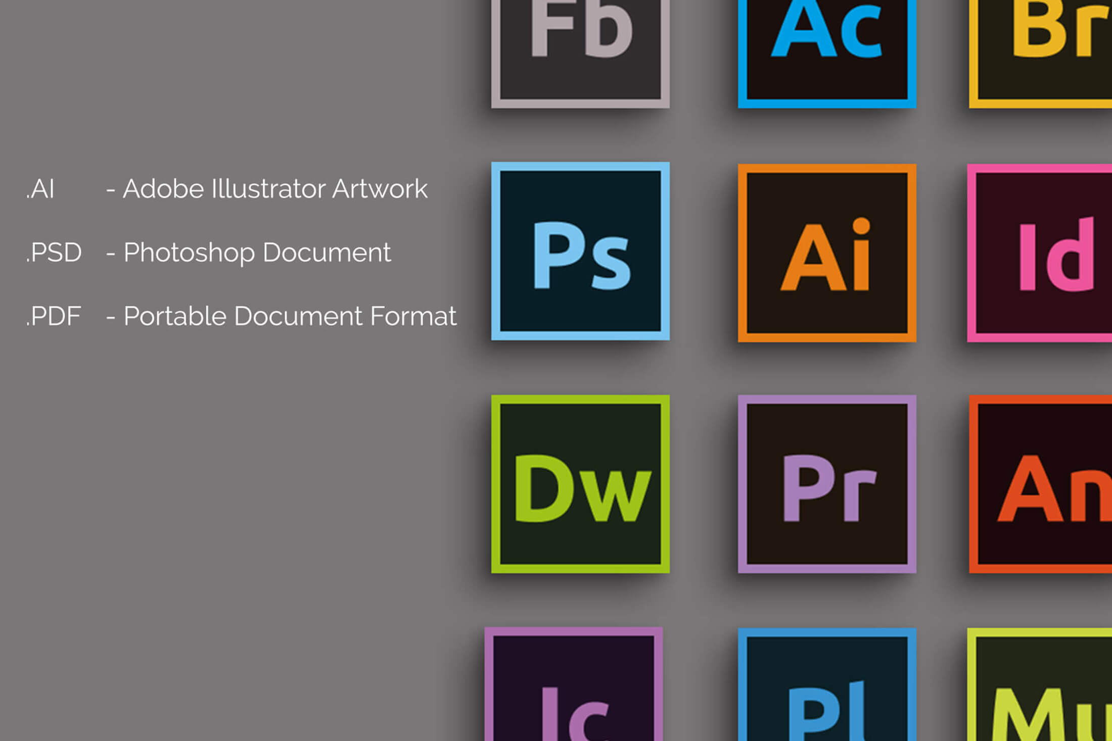
WHAT IS THE DIFFERENCE BETWEEN AI, PSD AND PDF?
So, the notorious Adobe Creative Suite file types. These are surprisingly self-explanatory really. An AI is the file type you get when you save a project from Illustrator, PSD from Photoshop and PDF is a document format. The difference between these is that an AI file is the rawest file type of the three, which has the earliest lines of the design, the original elements of your project. A PSD is usually a photo that you have edited, meaning that it is rarely used for logo or web design. A PDF is usually for text based projects, and is always the best option for print.
There are also two different types of PDFs: Print Ready and Press Ready. A Print ready PDF is for Desktop printing. A Press Ready PDF is a format used primarily for commercial printing. These differ from print ready PDFs as they must meet specific criteria for it to print well. Examples of these are: specific colours management, images and graphics that are of a high enough quality to print clearly, that the designer has kept suitable margins so that half the content doesn't get cut off when printed, and other requirements that take time and experience to get completely right.

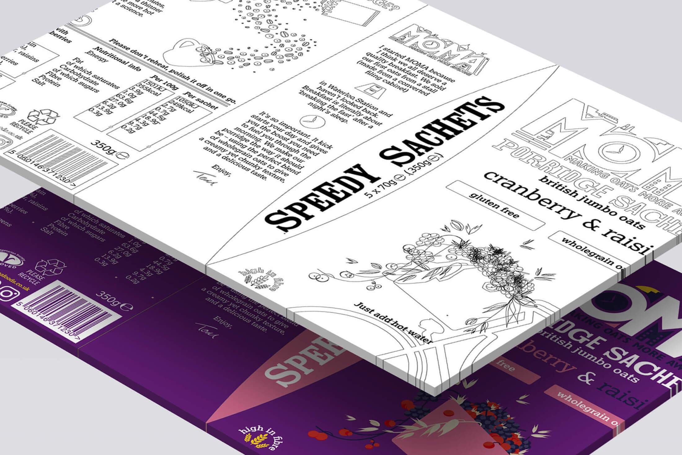
WHAT IS BLEED?
Bleed is, put simply, the extra blank space around the design to stop it getting cut off, and to keep the design running straight to the edges. When printed, the product will be cut to size, and if you have accounted for, usually, an extra ⅛” around the edge, it will be cut along that line, keeping your design covering the whole piece (whether its a business card, leaflet or poster) and keeping it safe.
The marks around the final print ready file are almost purely for the use of the printers. The ‘registration marks’, the little circles with crosses in them, are used to see if the colours have printed correctly. When printed, if the colours have merged properly, the whole circle will turn black, proving this fact, if it doesn't, then the printer knows that the colours have not printed correctly. The ‘trim marks’ the lines along the edges or in the corners of the document are pretty self explanatory, they show where the final print will be cut. The colour bars are for the printer’s use only, used to check the quality of the colour print.
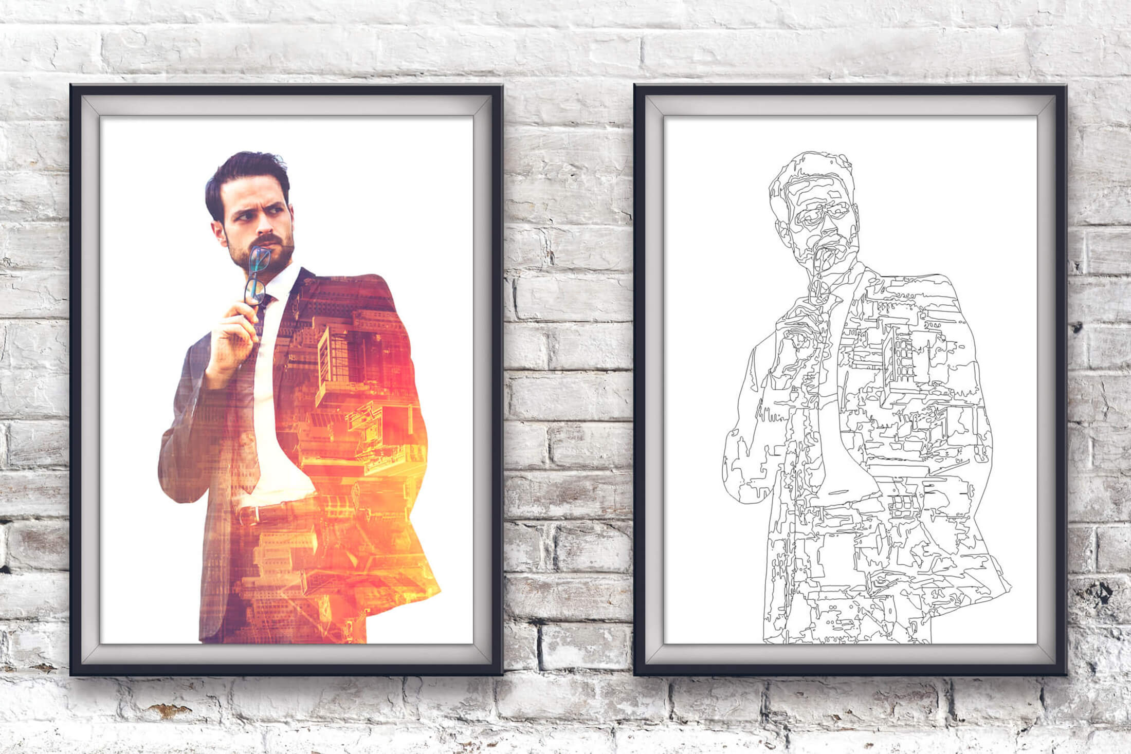
WHAT IS A VECTORED IMAGE AND WHY IS IT SO IMPORTANT?
Vectors are graphics that use mathematical definitions, with each line made of points with lines interconnecting them. These are graphics as opposed to photos. The difference being that vectors are more easily created, edited and therefore re-edited, with smaller file sizes. They are also completely scalable, with very little to no image distortion as the size changes. On a completely aesthetic note, they look good in print and are usually more aesthetically pleasing to onlookers, with clear detail and defined lines.
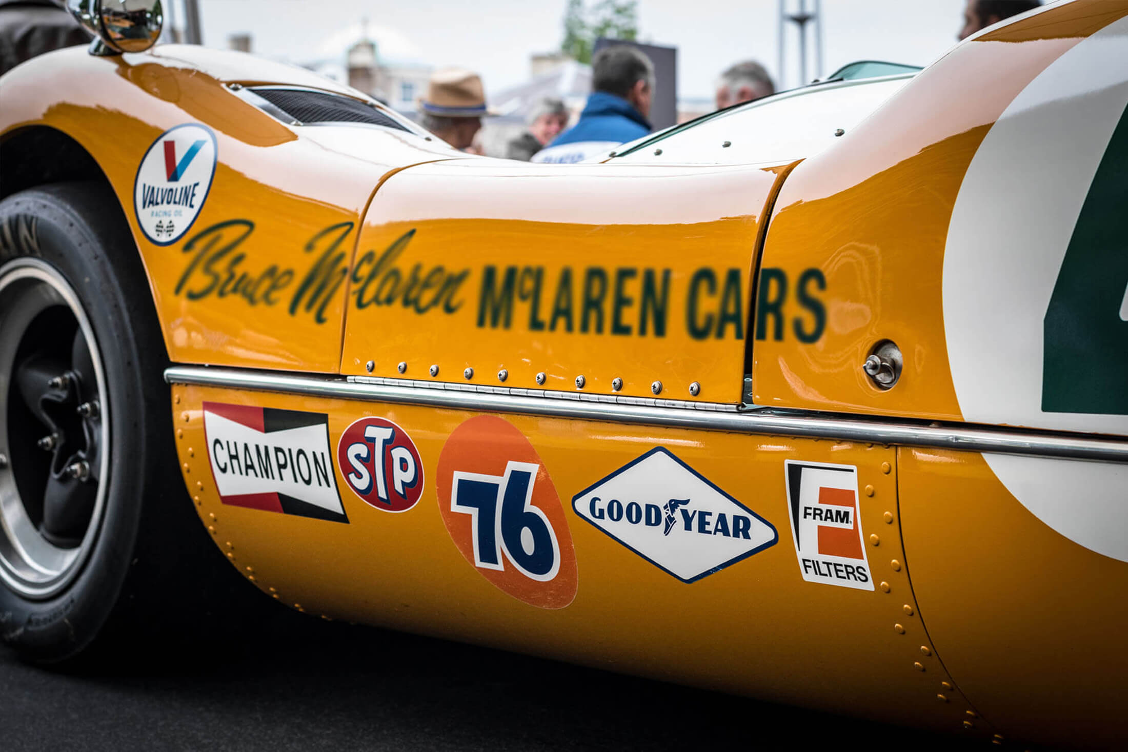
WHY CAN’T MY DESIGNER USE A JPEG FOR MY LOGO?
This is easy, and the answer is almost completely in the previous answer; logos need to be wholly scalable, clear, with better detail in print and if your logo is aesthetically pleasing anyway (being a vector), that’s a major bonus. Most applications of your logo will be across multiple mediums from web to vehicle liveries (like the image below) in a variety of products and produced in a variety of materials. Jpegs just can't offer that flexibility. Finally, and not often considered, with the smaller file size of a vector, it means that it will be easier to transport to printers, developers or other designers. Furthermore, if the logo is 10m wide on billboard or 2cm on a web page, it will be just as clear and detailed and your webpage will load quicker without a massive file causing it to slog along.
WHAT IS ILLUSTRATOR AND WHY IS IT DIFFERENT FROM PHOTOSHOP?
Adobe Illustrator is, according to Adobe themselves, ‘the industry-standard vector graphics app [that] lets you create logos, icons, sketches, typography, and complex illustrations for print, web, interactive, video, and mobile.’ This clearly lays out what you can do with Illustrator; create stunning vectors and graphics easily and effectively. Illustrator is mostly used for logos, artwork and text-art.
Photoshop (the clue is in the name) deals mainly with photos. It is ‘The world’s best imaging and design app [that] is at the core of almost every creative project. Work across desktop and mobile devices to create and enhance your photographs, web and mobile app designs, 3D artwork, videos, and more.’ This is where it differs greatly with Illustrator; where Illustrator is used to make logos, artwork and text-art, Photoshop is used for create, edit, enhance photos, and create 3D art and videos. Photoshop is rarely used for logo design or vector images.
WHAT IS THE 'GRID' AND WHY DOES MY DESIGNER TALK ABOUT 'IMAGE CONTRAST' AND 'WHITE SPACE' ALL THE TIME?
Put simply, all three of these are precautions and methods used to stop your design being overcrowded, confusing and busy.
Image contrast stops the design being boring, with either whole images or part of the images being eye catching and different. You wouldn't want an all white webpage, with no discernible features, you would want splashes or shapes of black or colours to make it exciting, eye catching and different.
The Grid - The elusive and most times invisible aid that the designer puts major importance on, and most people don't even know exist. This grid keeps your design clean and proportioned, with the rule of thirds keeping it pleasing to the eye. As said before, the grid is used to stop your design becoming overcrowded and busy. Clean lines, sharp layouts and proportioned webpages are what every designer strives to perfect, and you should too, it makes a huge difference, and most people don't know it exists.
White space is similarly important, it keeps it, again, from becoming overcrowded. Most commonly used in print, the ‘white space theory’ (which is hardly a theory, more a practice) says that if you have parts of the design that are either blank or very sparsely filled, it makes the design simpler and cleaner; more pleasing to the eye. It is also the space around the design, that keeps the design from being cut off in print. It is a double edged sword, with one edge keeping the design sharp, simple and pleasing, the other keeping it safe and sound when printed.

FINALLY, WHAT IS ‘BALANCE’ AND WHY IS IT IMPORTANT?
Balance, once again, keeps the design clean and pleasing to the eye. Just like ladybugs, symmetry is key in design. It doesn't even have to be the same size images.
The above example shows nice layout and balance with photos in a design. The images, while not all the same size, when put in pairs or trios, keep the balance and the layout. This is clean, and aesthetically pleasing as it is balanced and symmetrical. Balance is important as it stops the design being busy and overcrowed keeps it aesthetically pleasing and, hence the name, balanced. All these technologies and terminologies have evolved over many years, and that is why professional design requires knowledgeable, experienced and gifted designers who understand both the technology and the craft of design.
We hope this guide will help you to understand, make sense of, and compute the jargon and lingo that your designer is confusing you with.